
are u looking at www.dreadlockssite.com or www.dreadlockssite.com/main ?
--
My new book Ban The Taboo Vol 1
updated by @soaring-eagle: 07/10/15 02:23:29AM
new front page
Oh weird, I see it now, so its like a front door?
soaringeagle said:
soaringeagle said:
are u looking at www.dreadlockssite.com or www.dreadlockssite.com/main ?
exactlyther /main page will soon update to list where the / page was and the new front page, with a lil luck and messing around with it will get us within top 5 for a more general search for dreadlocksas we are now at 11, 21,000 searches got us only 320 clicks so u can imagine the difference 5 or 10 search positions will make, if we cabn get in the top 3 we will make a huuuge difference
Island Mamma said:
--
My new book Ban The Taboo Vol 1
Island Mamma said:
Oh weird, I see it now, so its like a front door?
soaringeagle said:are u looking at www.dreadlockssite.com or www.dreadlockssite.com/main ?
--
My new book Ban The Taboo Vol 1
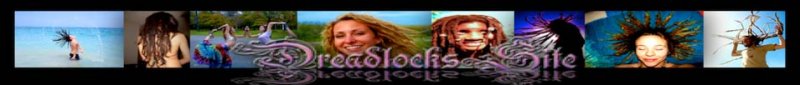
The three columns looks great. However, "enter the site" does not. It's difficult to read. If it were a solid image and not skewed it would look better and easier to find and click. Or even instead of an image it was just a bold red link. It's common to see on home pages, just a sentence and a link.Possibilities:For more information enter the siteFor access to the forums and answers to your dreadlock questions enter the siteOr even bold red links, listing forums, pictures, videos, etc. underneath enter the site or on the header.And a Join Dreadlockssite to sign up for an account link might be nice for those that want to join right away...placed under the "we do not try to sell you loctician services, or dreads products" and maybe a "Facebook for dreadheads" mention would be cool.Also, a link to FAQs, because newbies asking questions that are already answered run rampant.
hmm u thinl the image is hard? i think it stands out a faq and join links make sence tho.. gimme a min
MzElaineous said:
--
My new book Ban The Taboo Vol 1
MzElaineous said:
The three columns looks great. However, "enter the site" does not. It's difficult to read. If it were a solid image and not skewed it would look better and easier to find and click. Or even instead of an image it was just a bold red link. It's common to see on home pages, just a sentence and a link.
Possibilities:
For more information enter the site
For access to the forums and answers to your dreadlock questions enter the site
Or even bold red links, listing forums, pictures, videos, etc. underneath enter the site or on the header.
And a Join Dreadlockssite to sign up for an account link might be nice for those that want to join right away...placed under the "we do not try to sell you loctician services, or dreads products" and maybe a "Facebook for dreadheads" mention would be cool.
Also, a link to FAQs, because newbies asking questions that are already answered run rampant.
--
My new book Ban The Taboo Vol 1
Yeah, the pattern and skew on enter the site make it hard to read and it's not professional looking. Hehe, not that our site cares about being professional, but looking credible is good. I remember before I started my dreads I kept googling questions and dreadlockssite kept popping up, but I ignored it because the site didn't look that great. Finally, after the fifth time I caved and read the forums.
Anyway, plain bold red would stand out more than the current pattern/texture.
Other ideas:
-Placing the ads under "enter the site", under the image gallery. That way they see the pics first and makes them want to go in.
-Making the background image stay in place. It's easier to read the text that way. Looks better too.
soaringeagle said:
hmm u thinl the image is hard? i think it stands out a faq and join links make sence tho.. gimme a min
MzElaineous said:The three columns looks great. However, "enter the site" does not. It's difficult to read. If it were a solid image and not skewed it would look better and easier to find and click. Or even instead of an image it was just a bold red link. It's common to see on home pages, just a sentence and a link.
Possibilities:
For more information enter the site
For access to the forums and answers to your dreadlock questions enter the site
Or even bold red links, listing forums, pictures, videos, etc. underneath enter the site or on the header.
And a Join Dreadlockssite to sign up for an account link might be nice for those that want to join right away...placed under the "we do not try to sell you loctician services, or dreads products" and maybe a "Facebook for dreadheads" mention would be cool.
Also, a link to FAQs, because newbies asking questions that are already answered run rampant.
the links were red and they looked ghorrinble so i made em whire rio match the site and the enter the site button dont need to be readable just needsto be recognizable as an enter the site buttoni for rgew menu buttons to but theyre small easy to overlook
--
My new book Ban The Taboo Vol 1
--
My new book Ban The Taboo Vol 1