
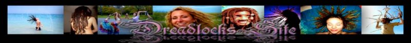
i made a new front pagfe, its not too fancy but its well optimized i believe to bring us a hell of alot more trafficif anyone wants to make it look cooler be my guest but the wording will need to stay the same till i can evaluate the performance and adjust itits my hope this will greatly increase traffic (by 10 times maybe)
--
My new book Ban The Taboo Vol 1
updated by @soaring-eagle: 02/14/15 12:23:52PM
new front page
oh also the currunt old front page is now linked to a new homre button the new address is www.dreadlockssite.com/main/ so if u want to bipass this new spash screen front page then go bookmark the /main pagei will want a spiffup on the front page ill add the slideshow now at least
--
My new book Ban The Taboo Vol 1
--
My new book Ban The Taboo Vol 1
ok theres still 1 issue i cant figure out clicku=ing the site name in the header takes u to the splash page im trying to find a way around it but uses some weird assed coding
--
My new book Ban The Taboo Vol 1
--
My new book Ban The Taboo Vol 1
the main purpose is to have way more ppl find us 1st and with a lil tweaking that shouldnt be too hardi'll just have to make minor lil changes every couple weeks till wee get therethe target keyword were at position 11 now i want us as close to 1 as possible and if we get there will make a massive diference
--
My new book Ban The Taboo Vol 1
--
My new book Ban The Taboo Vol 1
i like the idea of the front page and thinks it looks ok.... but we want it to look cool and i think the way it is, in a 4 column structure..... i think it looks a bit weird, maybe do it in 3 column or something..... the first column with the pic in it looks a bit out of place and think it would be wise to change it..... make it look more professional instead of slapped together..... just a though...... love the pic... but it just dont seem right to me.... idk maybe change it up a bit, but i love the idea of a front page
soaringeagle said:
looks the same to meok hows that
?? i removed the left collem and the big pic replaced it with 2 small pics in the bottom right and the counter and whos online in the leftadded a menu links to the main sections at top home forums bligs pics vids members
--
My new book Ban The Taboo Vol 1
--
My new book Ban The Taboo Vol 1